
Menu Design TIPs
Oct 16, 2024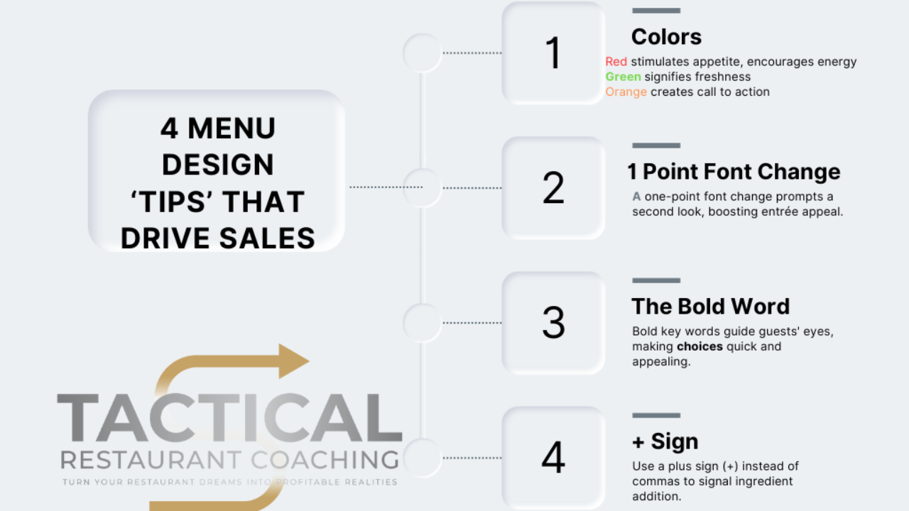
Menu Design: Leveraging Color and Font Psychology to Boost Sales
A well-designed restaurant menu goes beyond listing dishes; it's a strategic tool that can subtly influence guest choices and enhance dining experience. Every element on a menu, from colors to font choices, plays a role in guiding customer perception and can even increase sales. Here, we explore four impactful techniques: color psychology, subtle font adjustments, bold word emphasis, and the use of symbols like the "+" sign.
1. Colors and Their Psychological Impact
Each color carries mental and emotional associations that can set the tone for how guests perceive your menu and dining experience:
- Red: Red is dynamic, symbolizing energy and excitement—traits that can stimulate appetite and draw attention to specific items.
- Green: Signifying freshness and renewal, green hues (when carefully selected) can remind guests of nature and health. Avoid shades that veer towards illness-related hues.
- Orange: Known as a "call to action" color, orange encourages diners to make decisions and engage quickly.
Incorporate these colors thoughtfully in your menu to subtly influence guests’ emotions and increase the likelihood of sales on high-margin or signature items.
2. The One-Point Font Change
Sometimes, subtle tweaks make the biggest impact. Changing the font size of a particular dish by just one point can catch the brain's attention. The oldest part of our brain, often called the "reptilian brain," is naturally alert to irregularities—it’s part of our evolutionary survival mechanism. By slightly adjusting the font size of a menu item, you can draw attention to high-priority dishes without overwhelming the guest, leading them to take a second look at the item. Often, that extra attention is all it takes to increase sales of that item.
3. The Power of a Bold Word
Menus aren’t read; they’re scanned. Understanding this, highlighting specific keywords in bold can guide the guest's eye toward what you want them to notice most, like "Chef’s Special" or "Locally Sourced." Bold words grab attention, especially on items you’d like to promote or that are profitable. This visual guide makes it easier for diners to find and choose exactly what they’re looking for, improving their experience while boosting targeted menu selections.
4. The Plus Sign (+) for Ingredient Lists
Another simple yet effective visual cue is to replace commas with the plus sign (+) when listing ingredients. The symbol naturally implies addition, making it an easy shorthand that the eye and brain recognize quickly. This technique helps de-clutter the menu and keeps the focus on each ingredient as part of a unique whole, creating a streamlined, cohesive presentation.
By understanding the psychology behind these design choices, restaurant owners can make informed, tactical adjustments to menus that subtly guide diners’ decisions, leading to a better guest experience and increased revenue.
Stay connected with news and updates!
Join our mailing list to receive the latest news and updates from our team.
Don't worry, your information will not be shared.
We hate SPAM. We will never sell your information, for any reason.
